What Do They Eat?
Preference on Food and Restaurant for the Whole Country & Each State
See Details >>"The future of the nations will depend on the manner of how they feed themselves" , wrote the French epicurean Jean Anthelme Brillat-Savarin in 1826. Almost 200 years later, how nations feed themselves has gotten a lot more complicated. That's particularly true in the US, where "Nightlife" and "Bar" are everywhere, where food tracks and cheese shops are spreading, and where people preferred dining out at night and even midnight. In this project, we use multiple visualization techniques to show what are American favourite food and where their food comes from and whether the food is nutritious.
We started from the popular restaurants in US, to look at what kind of food and restaurant are preferred by Americans in different dimensions. We also dig into the eating habits in respect to times in a day and in a week. The data we used in this part is from “Yelp” database.
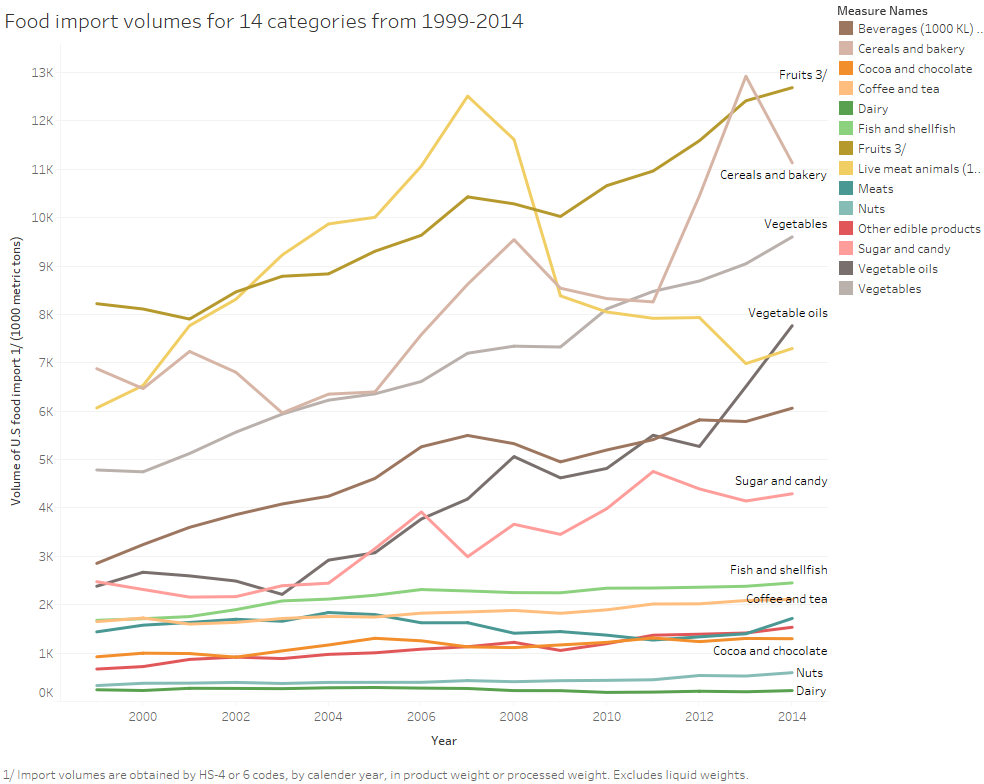
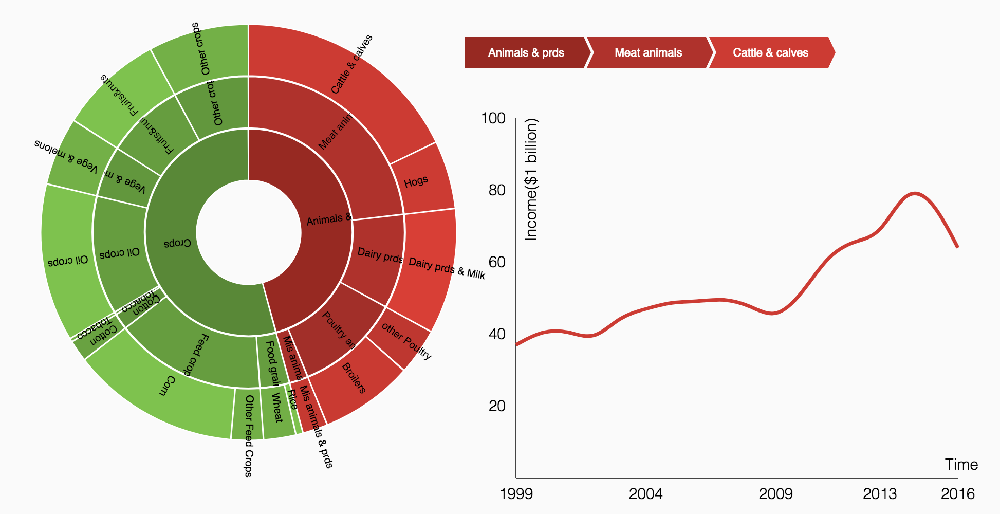
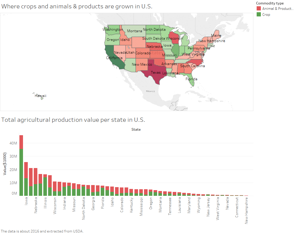
Then by looking at the data from USDA, we explore where these food come from. We derive two maps to present the countries that supply the most imported food and the states produce the most homegrown food. We also discover the volume and value tendency of these food as time goes by.
We also have a look at the food nutrition. Americans daily calories intake Data are also obtained from USDA. Visualizations show us clearly the tendency towards U.S. calories intake from 1970 to 2010. Besides, we present the detailed daily calories intake of different food. Based on these figures, we could draw a conclusion about how to have a healthy eating habit.
Preference on Food and Restaurant for the Whole Country & Each State
See Details >>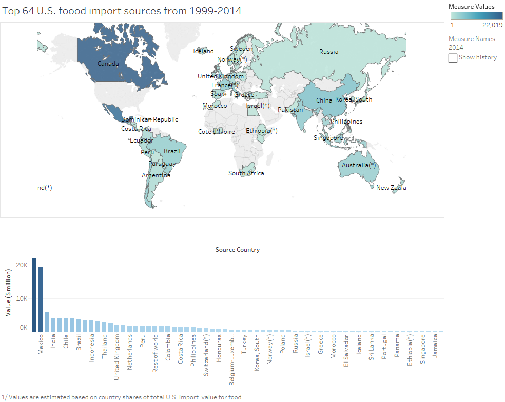
Investigate Relation Between American Food and Nutrition
See Details >>
jadis.yi@hotmail.com

qyzhu@connect.hku.hk

viola.shi@hotmail.com