Food and Nutrition in U.S.
Calories intake for an American in a day
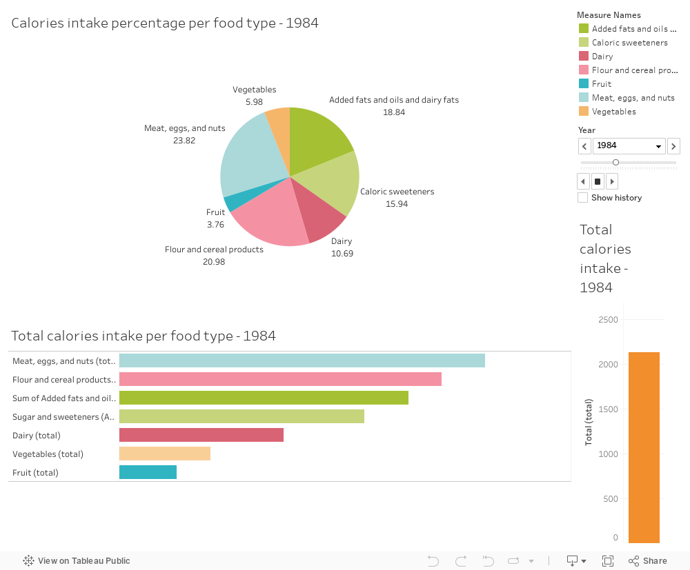
we plot a group of charts about the total calories intake per food type per American a day from 1970-2009. There are three charts, a pie chart showing the percentage of calories from each food type, a bar chart showing the detailed amount of calories intake from each type, and another bar chart with only 1 bar to show the total calories intake based on such a composition. All food are classified into 7 types: “meat, eggs, and nuts”, “flour and cereal products”, “sum of added fats and oil”, “sugar and sweeteners”, “dairy”, “vegetables”, and “fruit”. By locating the “year” attribute, the daily calories intake for an average American is displayed.
Then the following charts are giving the subtype information of each bar in the first bar chart mentioned in last visualization. For all of them, a common format is used, that is with x-axis separating the “year” information, and y-axis showing the calories amount. We could look at them one by one.