Homegrown Food
Food that self produced
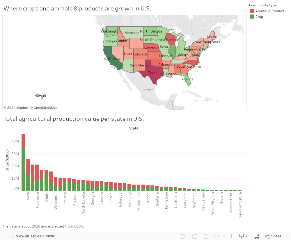
Where crops and animals & products are grown in U.S.
we plot a dashboard about the agricultural production value per state in US from 1999-2016. Generally two major colors are used, red and green, to represent animal products and crops
respectively. Again, the darker the color, the more production value the state contributed.
Even with a glance, we could find that California provides the majority of crops, and Texas provides the most animal products.
And most crops sources lie in the west coast and northern part of US, while
the animal sources are mostly distributed in the middle part and east coast of US.
Also, another clue we can get from this visualization work is California is also
the NO.1 state regarding to the value of agricultural production in US in 2016.
The more specific visualization from the point of homegrown product income at each food type (and subtypes) is given below. This chart follows the color
format used in the previous one, with red representing animal products and green representing crops.
To show the hierarchy structure of the food types, a solar structure is used here. By tapping a specific area in the solar chart, you could clearly see its corresponding
tendency on the right hand side with a line chart. We can see that,
1. Corn is king! How much money the US's harvests bring in, and the conclusion is unmistakable: corn, corn, corn.
2. Contrary to "Live meat animals" import volume, which is keeping decreasing after 2007, "Meat animals" self production value is
keeping going up from 2009 and 2015 and is responsible for about a half of animal & products income in 2016. We can conclude that after
financial crisis in 2007-2008, the "meat animals" in U.S. are almost from their own country.